The 10 new CSS3 features in 2023
As the digital landscape continues to evolve, so does the realm of web development. In 2023, CSS3, the latest iteration of the Cascading Style Sheets language, brings forth a host of new features that promise to enhance the way we design and interact with web content. Let’s delve into some of the most exciting features that CSS3 has to offer this year.
1. Container Queries
When designing a mobile website, we typically depend on Media Queries to adjust the layout according to the screen size. However, what if you wish to make alterations based on the dimensions of a content block? This is where Container Queries come into play. They enable you to adjust the styling of an element based on the size of its parent, in contrast to Media Queries, which apply changes based on the viewport size.
2. New Viewport Units
When creating a web page, it’s crucial to consider the screen size. One approach to designing with the viewport is by employing viewport height units (vh/vw), where 100vh represents 100% of the screen’s height. However, a drawback of this method is that it doesn’t account for the height of the browser’s toolbar on mobile devices.
To solve this issue, new unit values are now available :
Small viewport (svh/svw): takes the address bar and the toolbar into consideration
Large viewport (lvh/lvw): doesn’t take the address bar and the toolbar into consideration
Dynamic viewport (dvh/dvw): adapts its value when the toolbars are visible or/and when they are not.
It is important to know that these units don’t take into account the scroll bar. So depending on the situation, you might want to use one unit value over the other or just use another unit than the viewport.
3. CSS Nesting
With CSS preprocessors like Sass or Less, developers can nest a CSS style rule within another rule, facilitating the creation of clean and comprehensible code by minimizing redundancy and organizing lines. Native CSS now offers a similar capability with the syntax ‘&’ or ‘@nest’.
& syntax
The & has to be at the beginning of the selector for it to be valid. We can see it as a replacement for the parent selector.
4. Individual Transform Properties
A good way to give your website some animations or transitions is to use the transform property in CSS. The problem is if you want to change just one of the transform properties later on, you must write the whole definition again for all properties.
Example:
.childBlock1:hover {
    transform: translateX(0%) rotate(0deg) scale(0.9);
}

@media (max-width: 800px) {
    .childBlock1:hover {
        transform: translateX(0%) rotate(0deg) scale(1);
    }
}
In this example, the block will reduce its scale when we hover it with the mouse but we don’t want to have this effect when the screen is lower than 800px. As we see from all the 3 properties (translate, rotate and scale), only scale changed here, yet we have to repeat all other parts.
This is not the case anymore, with individual transform properties we can adapt each property individually.
Example:
.childBlock1:hover {
    scale: 0.9;
}

@media (max-width: 800px) {
    .childBlock1:hover {
        scale: 1;
    }
}
This is the same as the code above. The code is now simpler and cleaner and we don’t have to go through the trouble of writing the other properties.
5. Inset Property
Another property that gives us a shortcut in our code is the Inset property. This property replaces the four other properties: top, right, bottom, and left, allowing you to specify the inset of the positioned element on all four sides at once.
The order is in clockwise order just like it would be for a margin or padding.
Example:
.ParentBlock1 .ChildBlock1 {
    background-color: gray;
    inset: 25% 0 0 25%;
}

.ParentBlock2 .ChildBlock2 {
    background-color: green;
    top: 25%;
    right: 0;
    bottom: 0;
    left: 25%;
}
In this example, the gray and green blocks show the same result but with the Inset property, we get to write the position in one line.
6. Accent-color Property
Forms are one of the most common things to find on a website. If you have a form, there is a chance that you included checkboxes or radio buttons. Those elements are difficult to customize and most of the time, they are hidden and replaced with custom widgets.
The new CSS accent-color option allows you to have quick customization and give some colors to them.
Example:
#red {
    accent-color: red;
}

#green {
    accent-color: green;
}

#blue {
    accent-color: blue;
}

#checkbox {
    accent-color: black;
}
The option might not be as evolved as some people expected, but it can give you quick customization and save you some valuable time.
7. Gap Property for Flexbox
To specify the same distance between rows and columns, we needed to use the margin property. However, this had one inconvenience, the first and last elements also inherit the spacing around their edge which is not always intended. To avoid this issue, we would have to target those elements and apply an exception.
In contrast, the gap property allows us to put a space between the blocks without having to manipulate the first and last elements.
To achieve that, we have 2 ways to write that :
- In one line with the property gap
- In two lines with the properties row-gap and column-gap
Example:
body {
    display: flex;
    justify-content: center;
    padding: 20px 0;
}

.flex {
    width: 600px;
    display: flex;
    flex-wrap: wrap;
    column-gap: 20px;
}

.flex > * {
    flex: 1 1 130px;
    background-color: gray;
    padding: 35px 25px;
    text-align: center;
}
The result could’ve also been achieved by just writing gap: 30px 20px;. In the case where the row and column have the same value, the code could be even more simplified with gap: 30px;.
8. Logical Properties (Inline and Block)
We already have a shortcut for writing properties like margin or padding by setting the values on the x and y-axis. The inline and block properties allow us to do the same but it can even be applied to others like border, size… Inline applies to the horizontal while block applies to the vertical.
Example:
body {
    margin: 0;
    padding: 0;
    max-inline-size: 350px;
}

.ParentBlock1 {
    background: green;
}

.ParentBlock1 .ChildBlock1 {
    background: gray !important;
    text-align: center;
    margin-inline: 50px;
    border-block: 8px dashed white;
}
9. nth-of syntax
We are already familiar with the syntax nth-child in CSS, but now it’s getting a bit more advanced with the introduction of the keyword “of” which allows us to target more specifically an element.
:nth-child(x of . myClass) will first pre-filter all elements with the class myClass, and then target the element number x from the list.
Example:
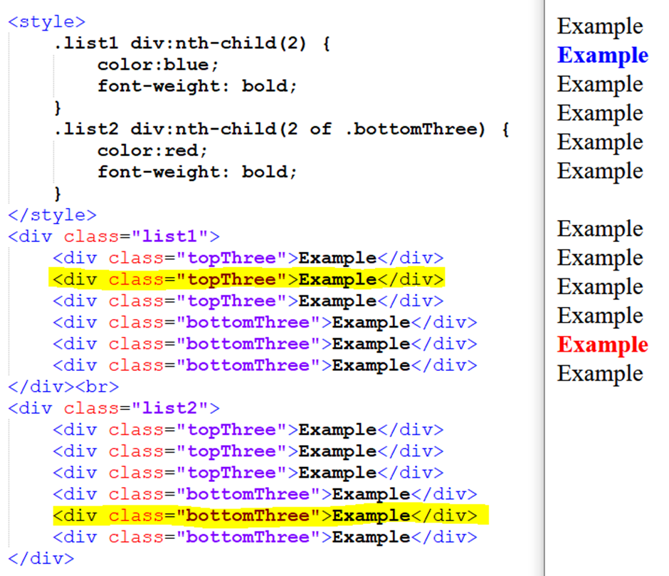
In this example, div:nth-child(2) lets us target the second div from the block list1, while in the list2 the div:nth-child(2 of .bottomThree) will first select all the elements with the class bottomThree and then give us the second element from it (which in this case is the 5th element of the list).
10. Selector :has()
With the feature above, we have a way to select a particular child element from a selector. With the :has() selector, we can apply styles by checking if a parent element contains specific children, or if those children are in a specific state. It’s essentially a “parent” selector.
We have different syntax for this selector:
h1:has(p): Selects the <h1> who have a <p> tag as a child no matter the level of it.
h1:has(> p): Selects the <h1> who have a <p> tag as a direct child.
h1:has(+ p): Selects the <h1> who are directly followed by a <p> tag.
Example:
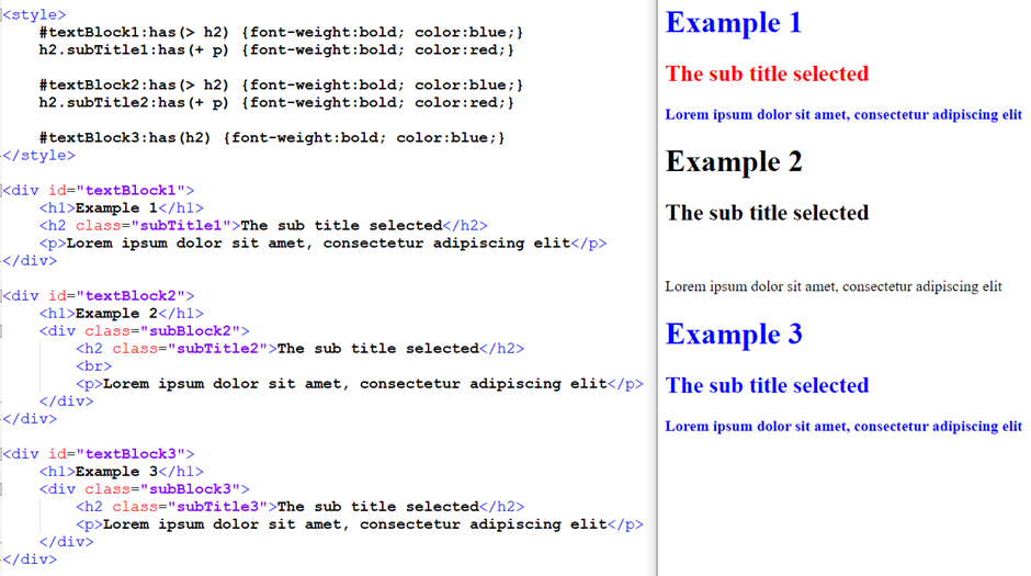
Example 1 fills all the conditions so the texts are displayed in blue and red like they should.
Example 2 gets no style because the conditions are not met:
The <h2> is not a direct child because it is inside a <div> (subBlock2)
The red is not applied because there is a <br> in between the <p> and <h2>.
Example 3 has the condition met because the <h2> is a child of #textBlock3. The level it is in doesn’t matter.
The :has() selector can be combined with another :has() and/or :not() which can allow us to do logical operators like AND and OR.
This property is still under development for Firefox but it is compatible with the other browser.
Conclusion
As we embrace the latest CSS3 features of 2023, it becomes evident that the evolution of web development continues to shape the way we engage with online content. These new capabilities not only expand the creative horizons of designers and developers but also underscore the ongoing commitment to accessibility, responsiveness, and cross-medium consistency within the digital landscape. With CSS3 at the forefront, the future of web design is poised to be more captivating and inclusive than ever before.